
Mastering Momentum: The Ultimate Guide to Multi-Timeframe RSI Dashboards
The Evolution of Technical Analysis: Why One Timeframe is No Longer Enough
In the fast-paced world of 2026, the financial markets have become more integrated and volatile than ever before. Traders who rely on a single timeframe to make decisions often find themselves caught on the wrong side of a massive trend reversal. This is because market momentum is fractal; what looks like a bullish breakout on a 5-minute chart might be nothing more than a minor retracement within a heavy downtrend on a 4-hour chart. To navigate this complexity, professional traders have turned to the Multi-Timeframe (MTF) RSI Dashboard.
The Relative Strength Index (RSI) has been a staple of technical analysis since its introduction by J. Welles Wilder in 1978. However, the modern era requires a more holistic approach. Instead of flipping through ten different tabs to check the momentum on various intervals, the MTF RSI Dashboard consolidates this critical data into a single, actionable view. This article explores how these dashboards work, why they are essential for contemporary trading, and how you can leverage them to achieve superior market timing.
Understanding the Relative Strength Index (RSI) Core
Before diving into the dashboard mechanics, it is crucial to understand the foundation. The RSI is a momentum oscillator that measures the speed and change of price movements. Traditionally, it fluctuates between zero and 100. Most traders identify levels above 70 as ‘overbought’ and levels below 30 as ‘oversold.’
However, the real power of the RSI lies not just in these extremes, but in its ability to show the strength of a trend. In a strong uptrend, the RSI often stays above 50 and frequently hits the 70 level. In a downtrend, it tends to stay below 50 and struggles to break above 60. When we look at this indicator across multiple timeframes simultaneously, we gain a three-dimensional view of market strength that a single chart simply cannot provide.
What is a Multi-Timeframe RSI Dashboard?
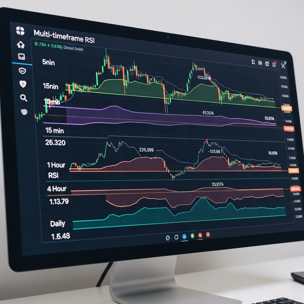
A Multi-Timeframe RSI Dashboard is a specialized UI component or indicator used in platforms like TradingView, MetaTrader, or custom proprietary software. It displays the current RSI value for a specific asset across several intervals—such as the 1-minute (M1), 5-minute (M5), 15-minute (M15), 1-hour (H1), 4-hour (H4), and Daily (D1) charts—all in a single table or grid.
In 2026, these dashboards have evolved significantly. Many now feature heatmaps, where color-coding (green for bullish momentum, red for bearish) allows traders to scan dozens of currency pairs or stocks in seconds. The goal is simple: to find ‘confluence,’ the moment when momentum aligns across multiple time horizons.
The Strategic Benefits of Using an MTF Dashboard
1. Trend Alignment and Confirmation
The most significant advantage of an MTF RSI dashboard is trend confirmation. If you are looking to enter a long position on the 15-minute chart, your probability of success increases exponentially if the 1-hour and 4-hour RSI are also trending above 50. Trading against the higher-timeframe momentum is one of the most common mistakes retail traders make; the dashboard acts as a visual safeguard against this error.
2. Drastic Reduction in Noise
Lower timeframes are notoriously noisy. A sudden spike in the M1 RSI can trigger a false buy signal. However, if the MTF dashboard shows that the H1 and H4 RSI are deeply oversold, that small M1 spike might actually be the start of a major reversal. Conversely, if the higher timeframes are overbought, you know that the small M1 spike is likely a ‘bull trap’ and should be avoided.
3. Efficiency and Speed
In the current trading environment, speed is everything. A dashboard allows you to monitor an entire watchlist (e.g., EUR/USD, BTC/USD, Gold, S&P 500) on a single screen. Instead of spending 30 minutes clicking through charts to find a setup, the dashboard highlights the assets that meet your specific RSI criteria instantly. This efficiency is what separates part-time hobbyists from high-performance traders.
Advanced Strategies with the Multi-Timeframe RSI Dashboard
The ‘Momentum Cascade’ Strategy
The Momentum Cascade is a popular strategy in 2026 that focuses on the ‘ripple effect’ of momentum. Traders look for a scenario where the higher timeframes (Daily and H4) have recently crossed the 50-level, indicating a structural shift in trend. They then wait for the lower timeframes (M15 and M5) to pull back into an oversold state (below 30) while the higher timeframes remain bullish. When the lower timeframes turn back up, it creates a high-probability entry point aligned with the ‘cascade’ of momentum flowing from the larger charts down to the smaller ones.
Detecting MTF Divergences
Divergence occurs when the price makes a new high, but the RSI makes a lower high. While a single-frame divergence is powerful, an MTF divergence is devastatingly accurate. If you notice a bearish divergence on the H1 chart and your dashboard shows that the H4 RSI is also starting to curve down from an overbought reading, the signal is significantly more reliable. The dashboard allows you to spot these multi-layered divergences without having to manually draw lines on six different charts.
Technical Implementation: Building Your Own Dashboard
For those who prefer a DIY approach, building a basic MTF RSI dashboard in languages like Pine Script (for TradingView) or MQL5 has become much more accessible. The core logic involves calling the `request.security` function (in TradingView) for each desired timeframe.
Key Features to Include:
- User-Defined Timeframes: The ability to toggle between scalping (M1-M15) and swing trading (H1-Weekly) views.
- Custom Thresholds: Options to change the 70/30 levels to 80/20 for more volatile assets like cryptocurrencies.
- Alert Integration: In 2026, the best dashboards are linked to mobile push notifications or Telegram bots. You should be notified when four or more timeframes align in the same direction.
- Visual Heatmaps: Using gradients (e.g., deep green for RSI > 70, light green for RSI > 50) helps the human brain process the data faster than reading raw numbers.
Psychological Benefits: Combating FOMO and Analysis Paralysis
Beyond the technical merits, there is a massive psychological advantage to using a dashboard. Many traders suffer from ‘Analysis Paralysis’—the inability to make a decision because they are overwhelmed by too much conflicting data. A dashboard simplifies the data into a binary choice: Is momentum aligned, or is it not?
Furthermore, it helps combat FOMO (Fear Of Missing Out). When you see a massive green candle on the 1-minute chart, it’s easy to chase the price. But a quick glance at the dashboard might reveal that the 4-hour RSI is at 85 (extremely overbought). The dashboard provides the ‘objective truth’ that helps you stay disciplined and wait for a better entry.
The Future of Dashboards in 2026 and Beyond
As we move further into 2026, the MTF RSI dashboard is evolving into a more intelligent tool. Artificial Intelligence is now being integrated into these dashboards to predict the *likely* path of the RSI based on historical patterns. Some advanced systems now combine RSI data with volume-weighted metrics and order flow analysis, providing a comprehensive ‘Sentiment Score’ alongside the traditional RSI values.
Moreover, cloud-based dashboards are now the standard, allowing traders to sync their settings across desktop, tablet, and wearable devices. Whether you are at your desk or on the move, the ability to see the global momentum of an asset at a glance is a prerequisite for success in the modern financial landscape.
Common Pitfalls to Avoid
While the MTF RSI dashboard is a potent tool, it is not a magic wand. Here are a few mistakes to avoid:
- Over-Reliance: Never use the RSI in a vacuum. It should be combined with price action (support and resistance) and perhaps a volume indicator.
- Lagging Nature: Remember that the RSI is a lagging indicator. It tells you what has happened. While it is excellent for measuring strength, it cannot predict black swan events.
- Timeframe Overload: Don’t try to monitor ten timeframes at once. For most traders, three to five intervals (e.g., M5, M15, H1, H4) are the ‘sweet spot’ for clarity and decision-making.
Conclusion: Why You Should Upgrade Your Workflow
The Multi-Timeframe RSI Dashboard is more than just a convenience; it is a structural upgrade to a trader’s decision-making process. By providing a bird’s-eye view of market momentum, it allows you to trade with the wind at your back, confirming short-term moves with long-term trends.
In 2026, the markets do not forgive those who trade blindly. By integrating an MTF dashboard into your routine, you are giving yourself the gift of clarity, the advantage of speed, and the confidence of confluence. Whether you are a seasoned pro or a developing trader, seeing the ‘big picture’ through the lens of RSI momentum is one of the most effective ways to sharpen your edge and protect your capital in an increasingly complex world.